Documenting the design process
Article
After multiple workshops and talks for designers, on how to improve the photography skills in design studios, I decided to write an article with useful tips and tricks for design research, workshops and/or culture documentation. The article goes through Lighting, Compositions, field work and how to take a simple portrait.
After multiple workshops and talks for designers, on how to improve the photography skills in design studios, I decided to write an article with useful tips and tricks for design research, workshops and/or culture documentation. The article goes through Lighting, Compositions, field work and how to take a simple portrait.
After multiple workshops and talks for designers, on how to improve the photography skills in design studios, I decided to write an article with useful tips and tricks for design research, workshops and/or culture documentation. The article goes through Lighting, Compositions, field work and how to take a simple portrait.
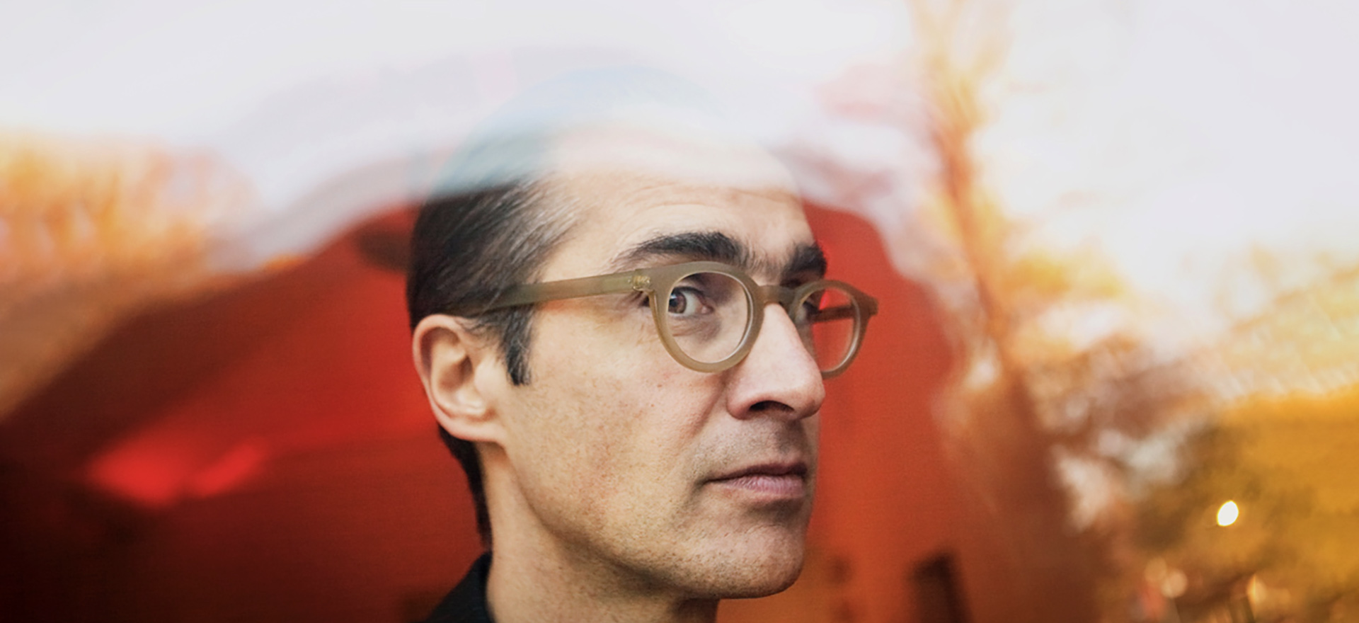
The light — It’s everywhere, just start looking
Photography is all about light. No light — no photo. Try to start noticing the light around you. How it falls on the person across from you, the way it reflects off the water … These are things that can either help or ruin your picture.
Light has different temperatures
Do you have a lamp near by? If so, it probably casts a yellow light, but if you look outside it’s a more of a blue light. Having a lot of different coloured light in a picture usually means a lot of extra post-work. If the natural light is ok, turn off all the other lights.
Once you start seeing the differences in temperature you can start using it to your advantage and create effects with it.
The sun and the golden hour
The sun is not your friend. In general direct sunlight makes for very hard-contrast, rough pictures. If you have to take pictures outside, try to do it in the shade, or if you can plan, do it around the golden hour (those hours of soft light after dawn and before dusk). This will make for a way nicer softer light.
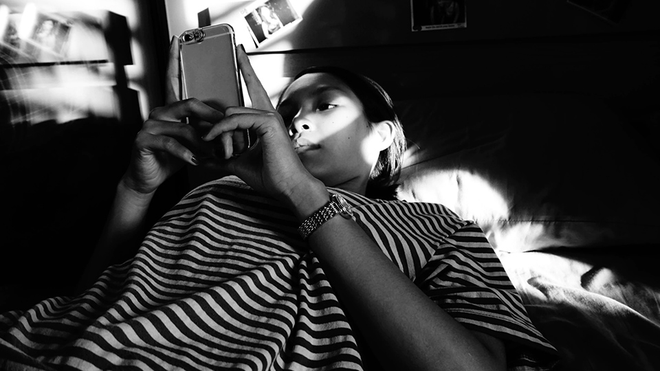
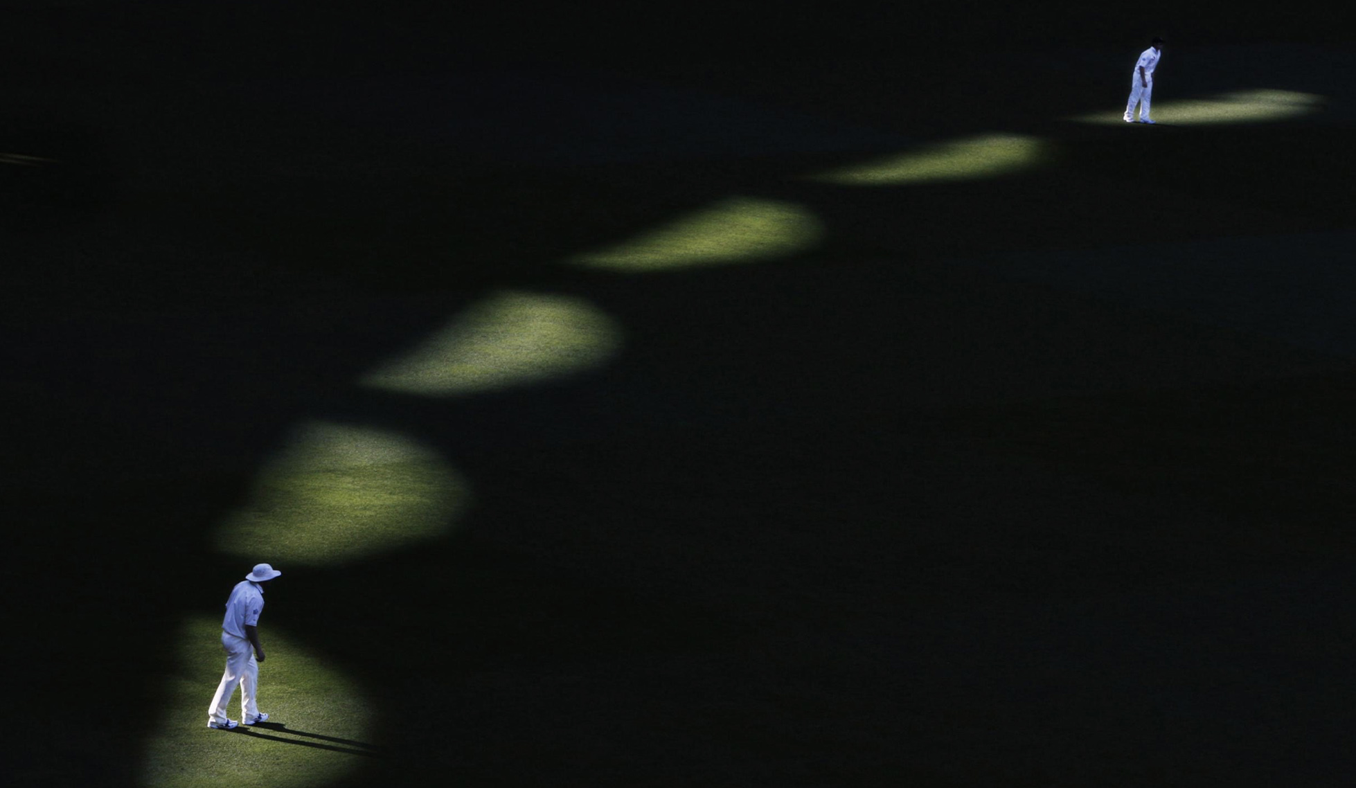
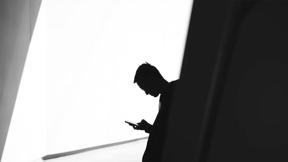
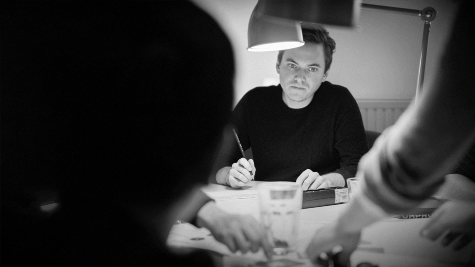
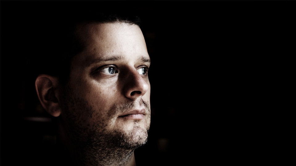
The absent of light can focus your picture.
There is usually light around even if you don’t think so. Don’t always rely on the flash, use the existing light instead. You might be surprised by the nice effect it can create.
Compositions — Your friend Fibonacci
I’m going to go through 6 simple composition rules. There are plenty of other ones, but if you follow these, there’s a big chance that your picture will look a little bit nicer. (Unfortunately there won’t be that many work pictures because of the NDA:s)
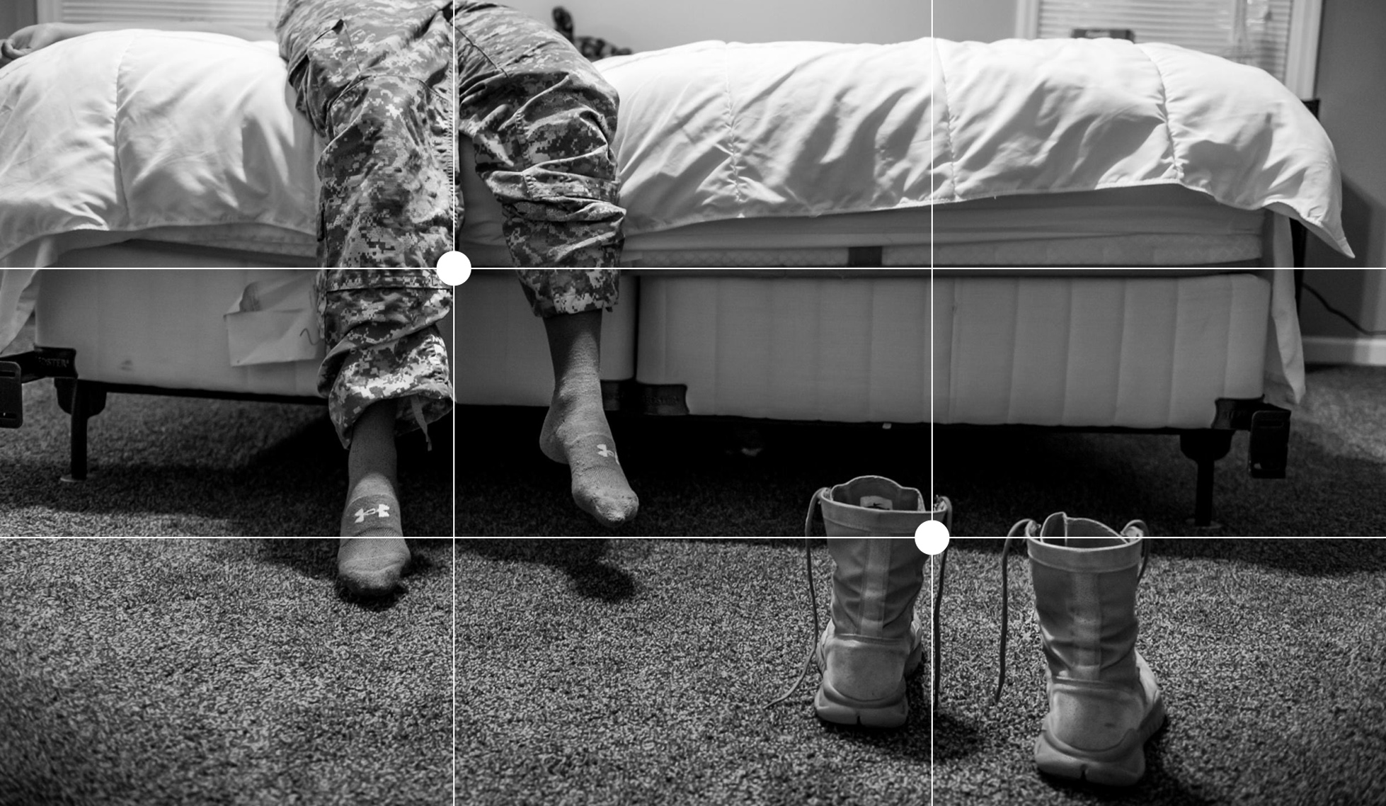
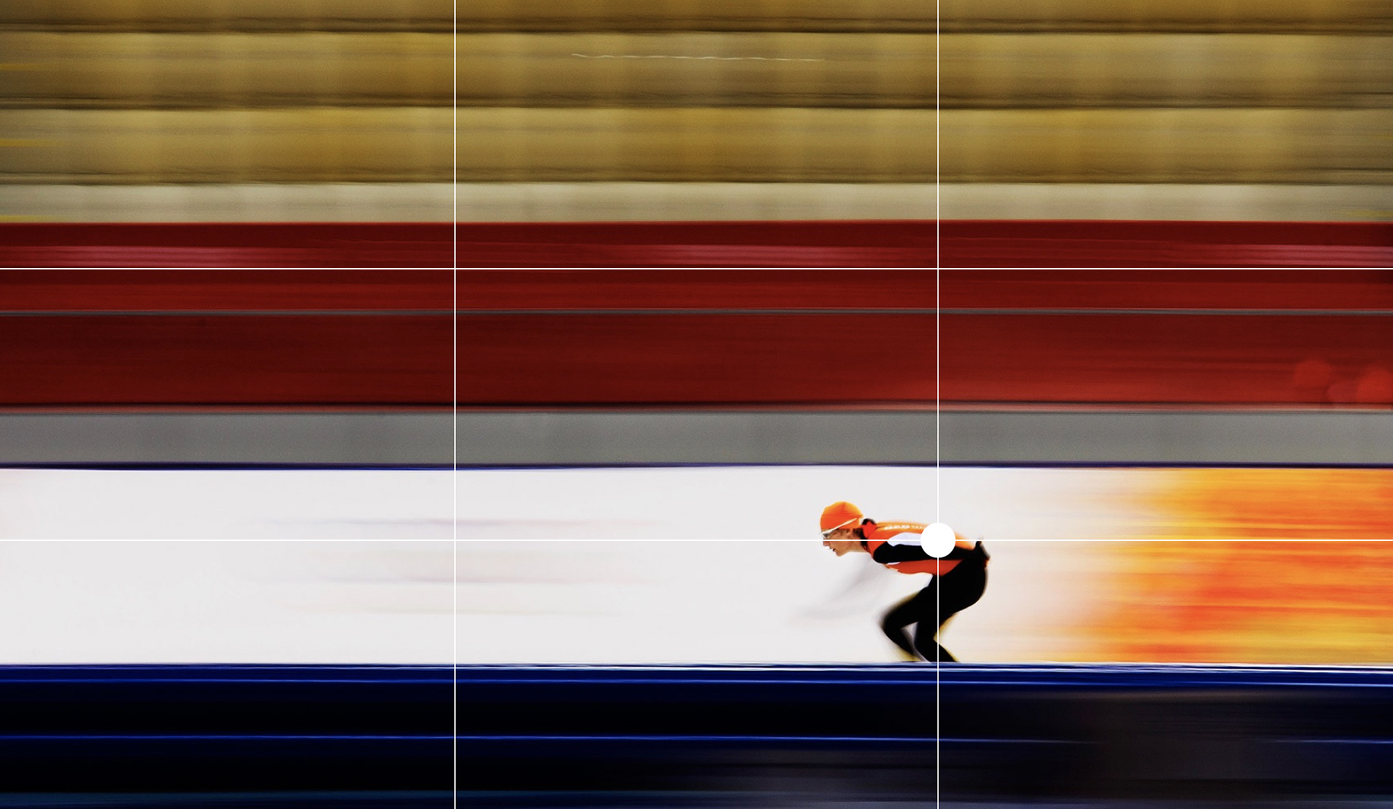
1. Rule of thirds
This is one the most classic composition rules. The idea here is to divide the image into thirds, then you place the important element(s) on one or multiple of these lines. This is a very well used method because the human eye is automatically drawn these points.
If you feel like you need help with this, most cameras even have a rule of third setting to help guide the users. This could be helpful in the beginning, but once you’ve taken a couple of pictures you will do it automatically.
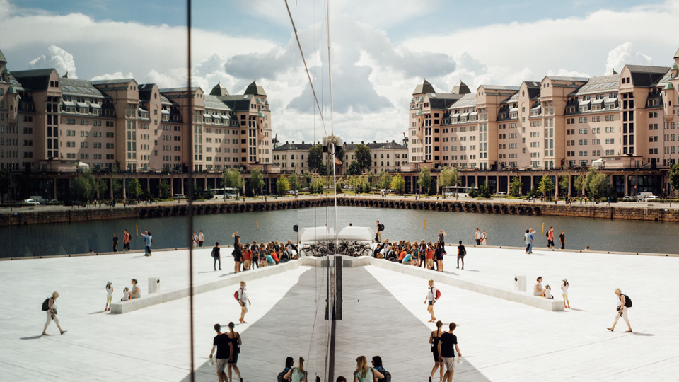
2. Symmetry
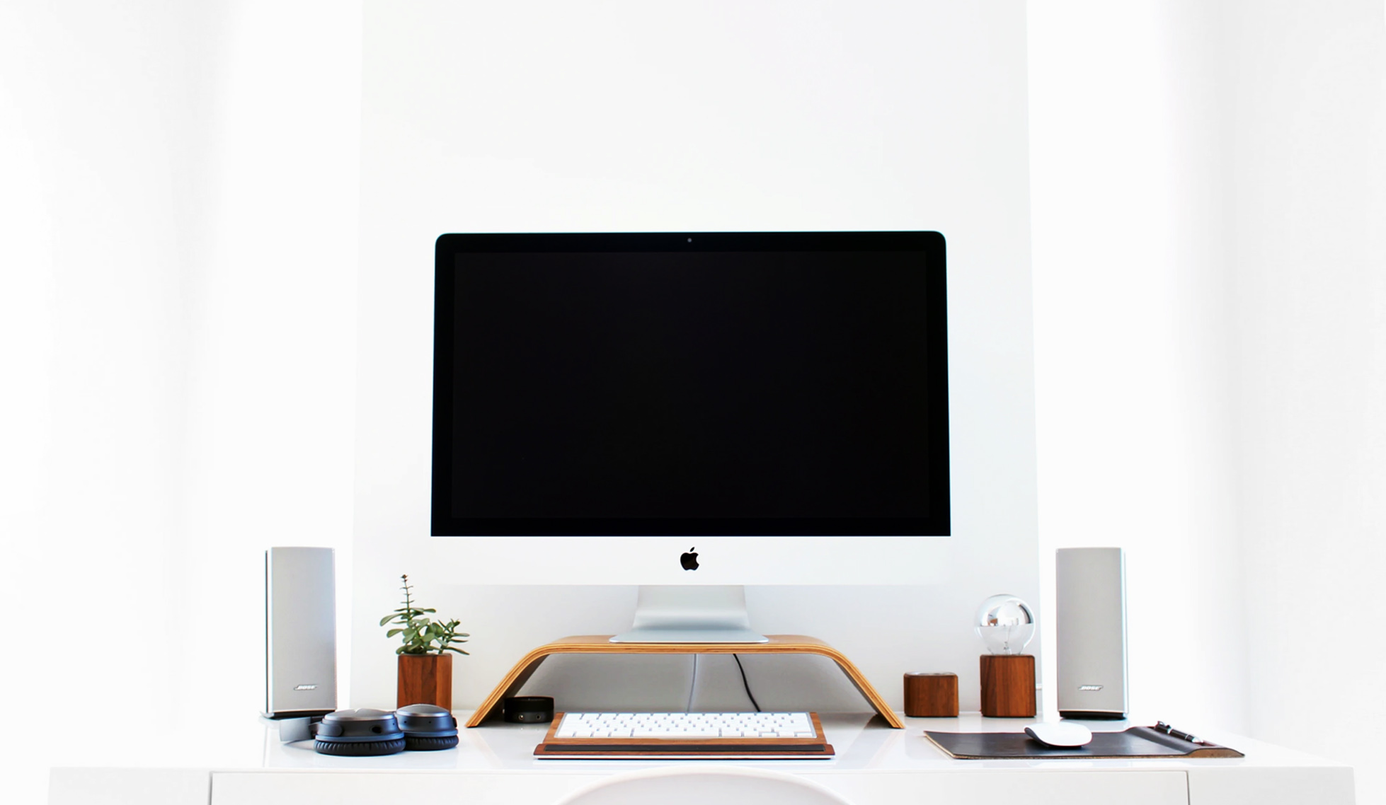
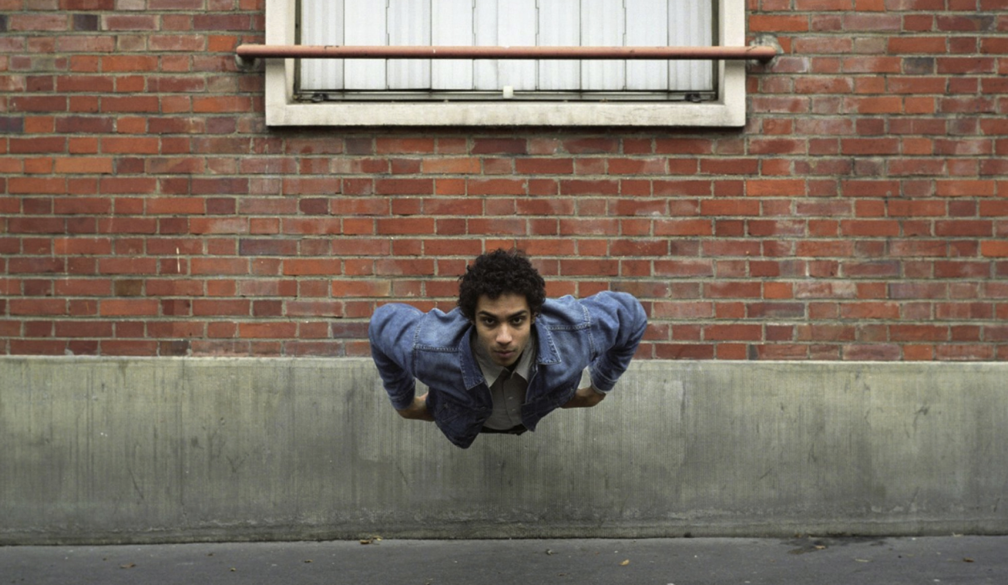
Symmetrical photos stand out because humans are drawn to visually harmonious photos. To make this work you want to create an almost perfectly symmetrical picture. This will make the viewer want o look at the picture longer, trying to understand the patterns of it.
You can use symmetry by placing your elements in a symmetrical environment or place your element in the middle and work your way out.
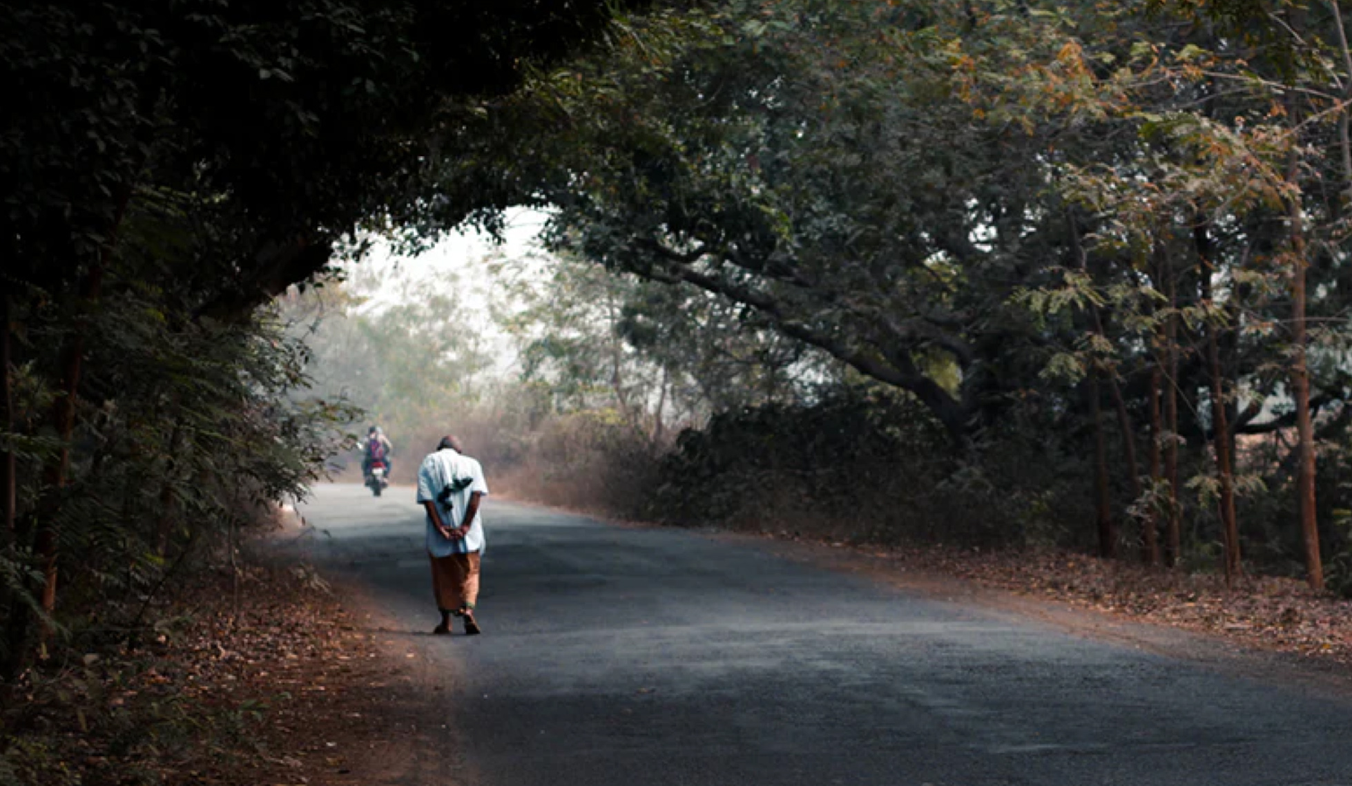
3. Framing
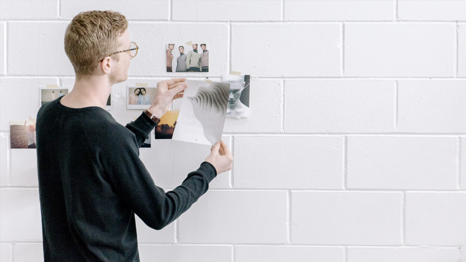
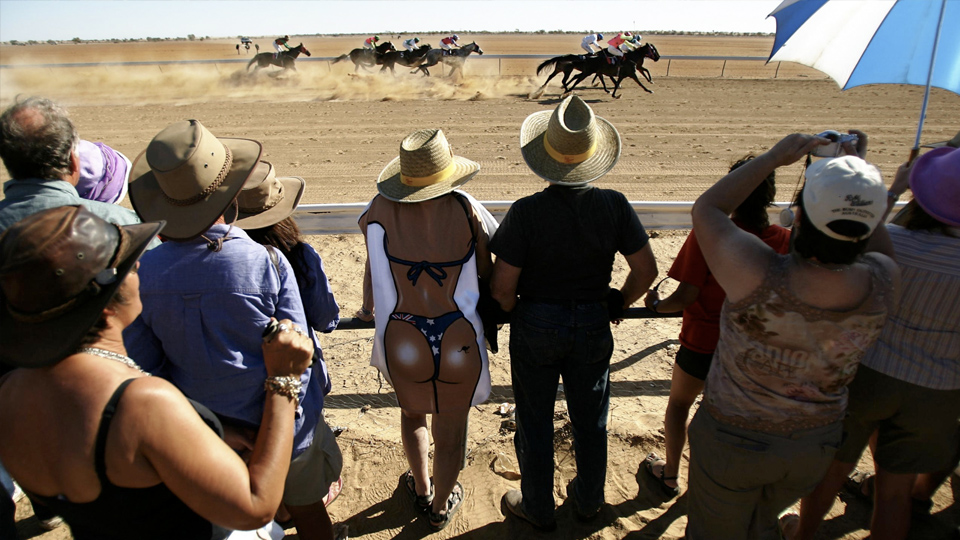
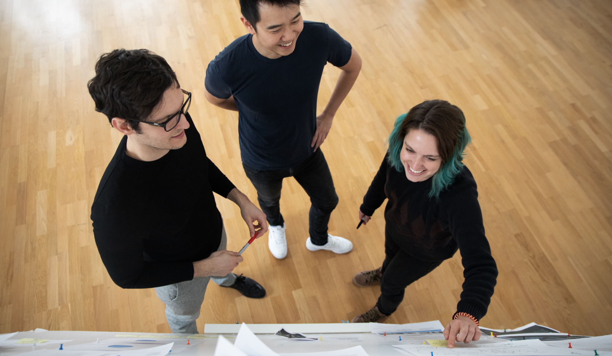
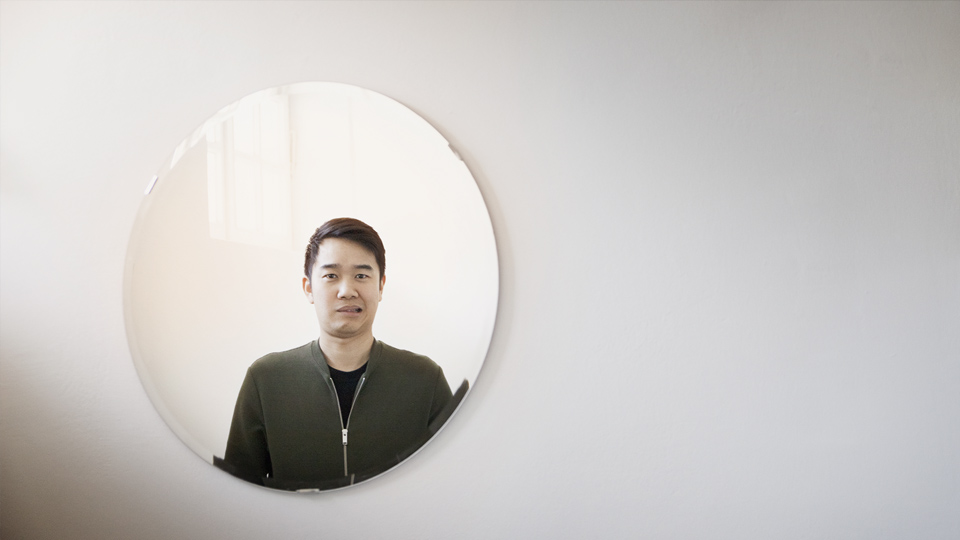
Framing is when you use the environment to frame the important element(s) of the picture. This can be obvious frames, like windows and arches, or it can be elements that are less obvious like branches and people.
There will be plenty of opportunities to use framing. For workshops you can use all the people and in interviews and testing session doors and windows are easy targets.
4. Leading lines
Here you use lines that catch the viewer’s eyes and help guide them to the important element(s) of the picture. This can be physical lines or any elements that naturally draws your eye.
It’s hard to give very tangible examples of leading lines in the settings you will be working in since it’s such an environment dependent composition. Just look around when you work and you will find things that you can use.
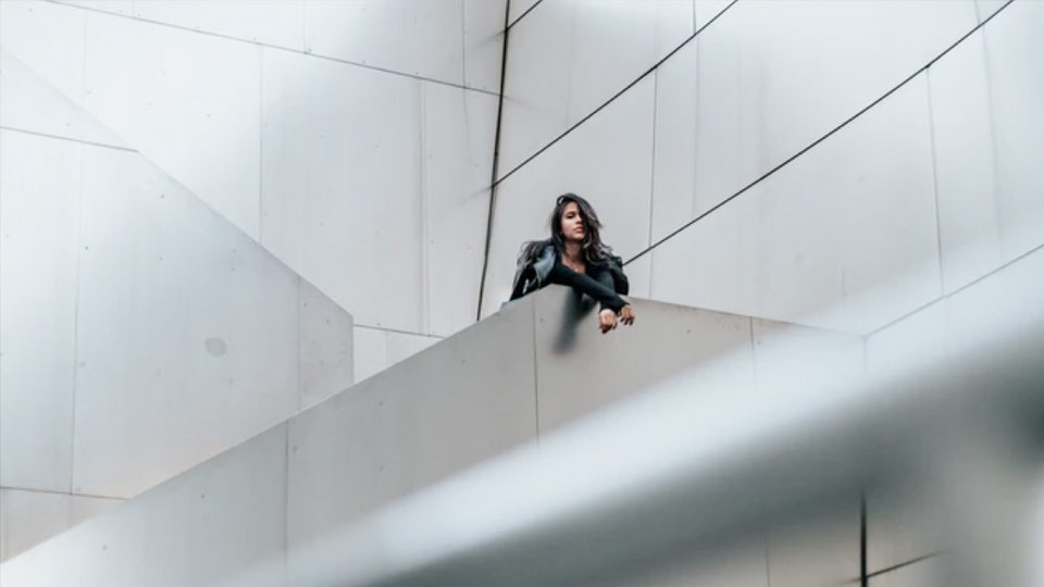
5. Depth
Photographs are 2D by nature, using elements at different depths in your image will help it feel more alive.
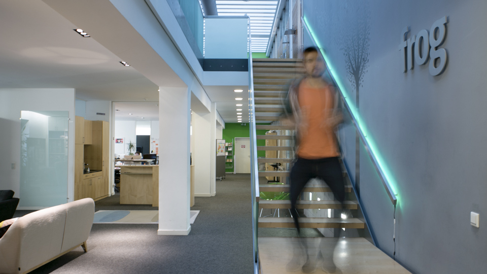
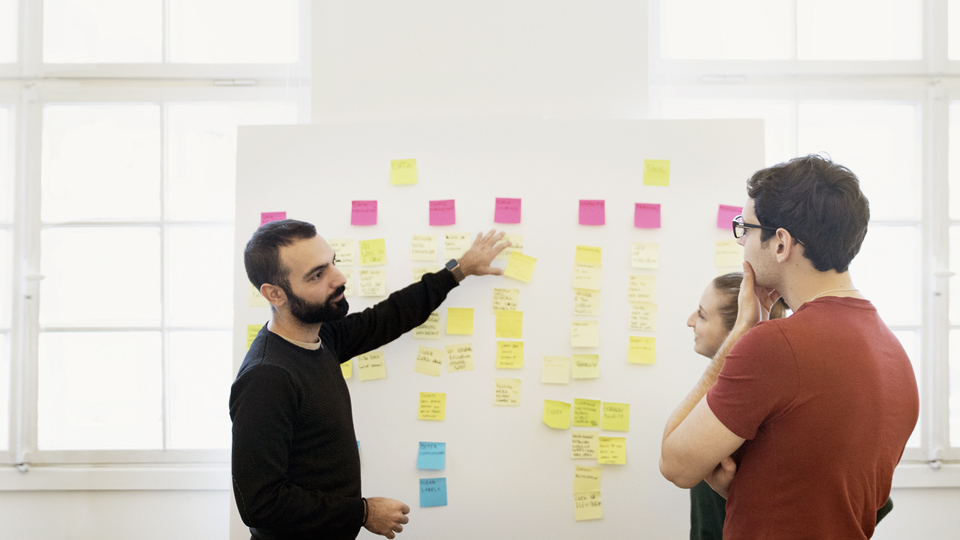
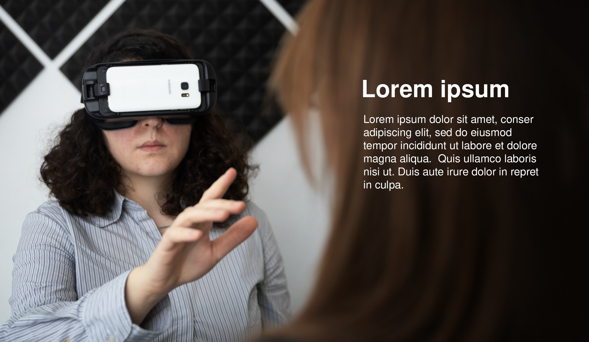
In a work setting, this can be used to show multiple groups working at different workshop stations or to show the the size of your studio with people working in different places. But you can also use the technique by putting an interviewer in the foreground to show that it’s an interviewing session.
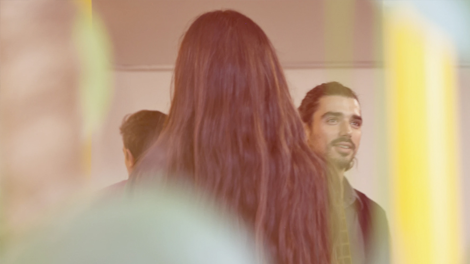
6. Isolate
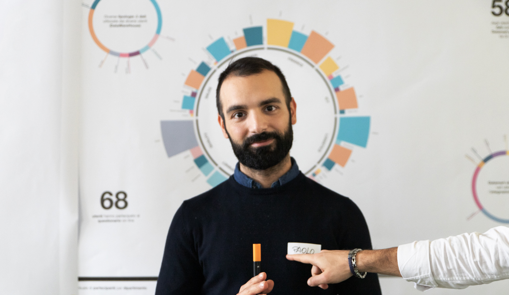
To create focus you isolate the element(s) with a shallow depth of field. The blurry background helps the viewer find the focus point. Another way to create the effect is to use space around the element(s)
This is a particularly useful technique for shooting portraits, but can also be used, to show that important elements in your session, like post-it or to highlight an interaction in a user testing. I tend to use this for close-ups in cases where your subject has to be anonymous.
In the field — what to think about
The most common mistake most designers and design-researchers do when taking picture, is to not prepare. They don’t get familiarised with the camera or don’t create a check-list for what pictures they need.
Learn how the camera works and prepare what photos you need!
1. A dynamic roll
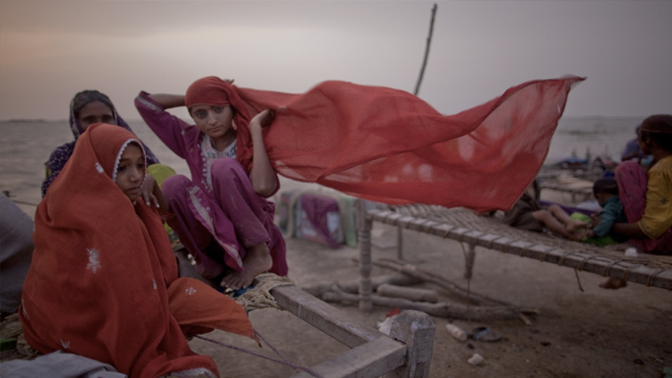
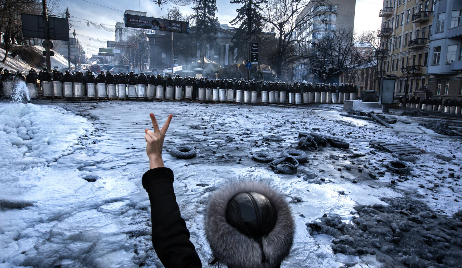
I don’t know how many times I’ve put together client presentation, realising that all the pictures from the workshop or the user-testing session looks exactly the same. When you do a job you need to be sure that you come back with a variety of images. Try to create a story with your photos. Have a look at World Press Photo, you can find some amazing stories there that might inspire you.
1. Portrait, dare to get close
1. Portrait, dare to get close
1. Portrait, dare to get close
2. Interaction with people, capture emotions
2. Interaction with people, capture emotions
2. Interaction with people, capture emotions
3. Interaction with object, what is happening
3. Interaction with object, what is happening
3. Interaction with object, what is happening
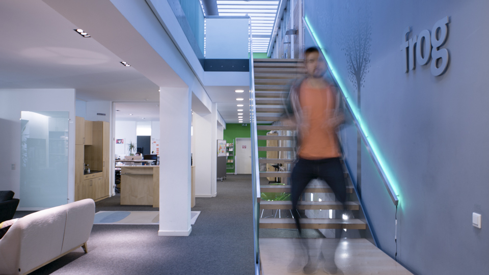
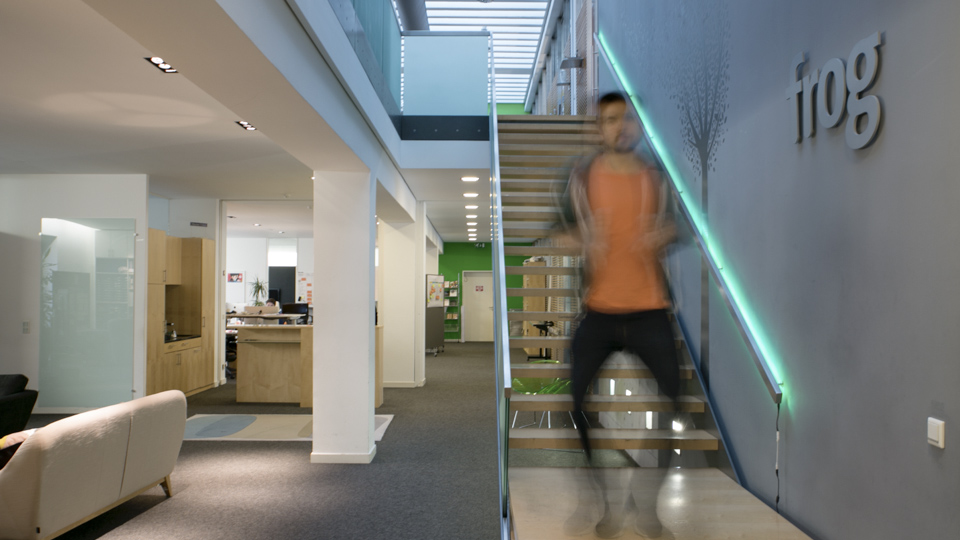
4. Interiors, how does the place feel like
4. Interiors, how does the place feel like
4. Interiors, how does the place feel like
5. Close-ups, what are the details you see
5. Close-ups, what are the details you see
5. Close-ups, what are the details you see
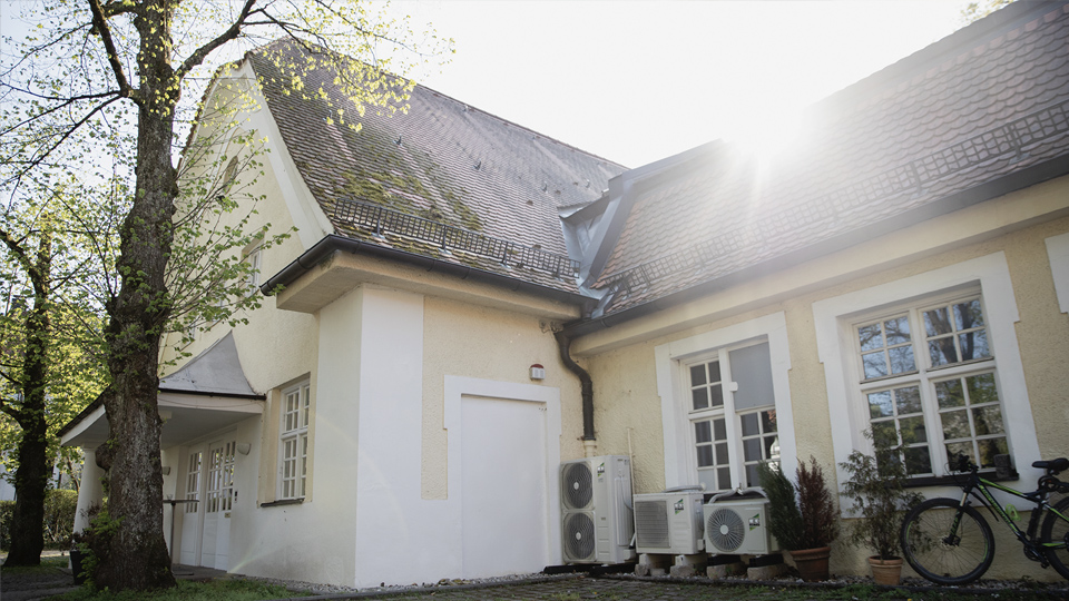
6. Environments, zoom out, where was it
6. Environments, zoom out, where was it
6. Environments, zoom out, where was it
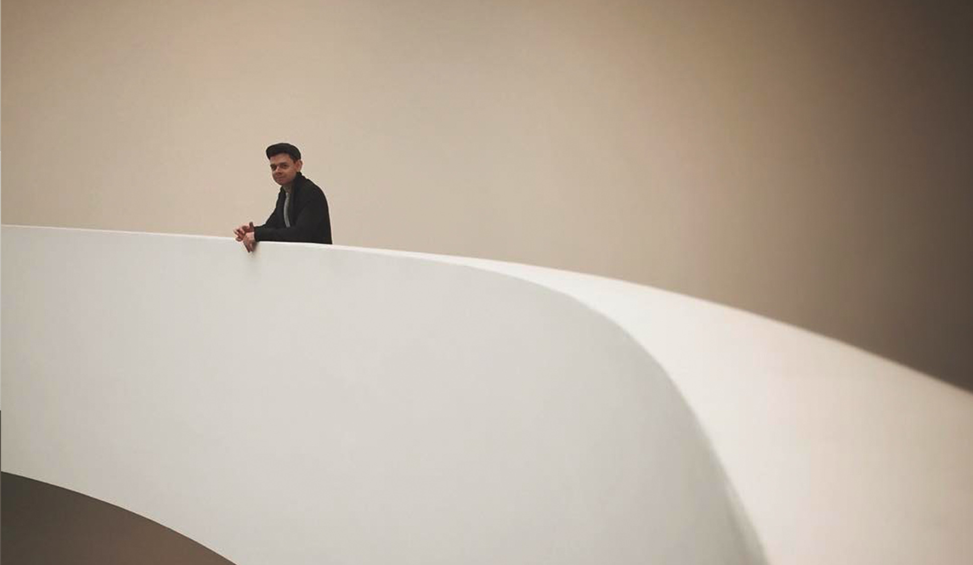
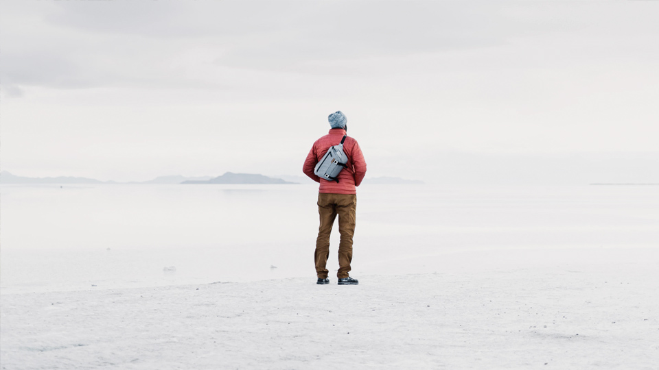
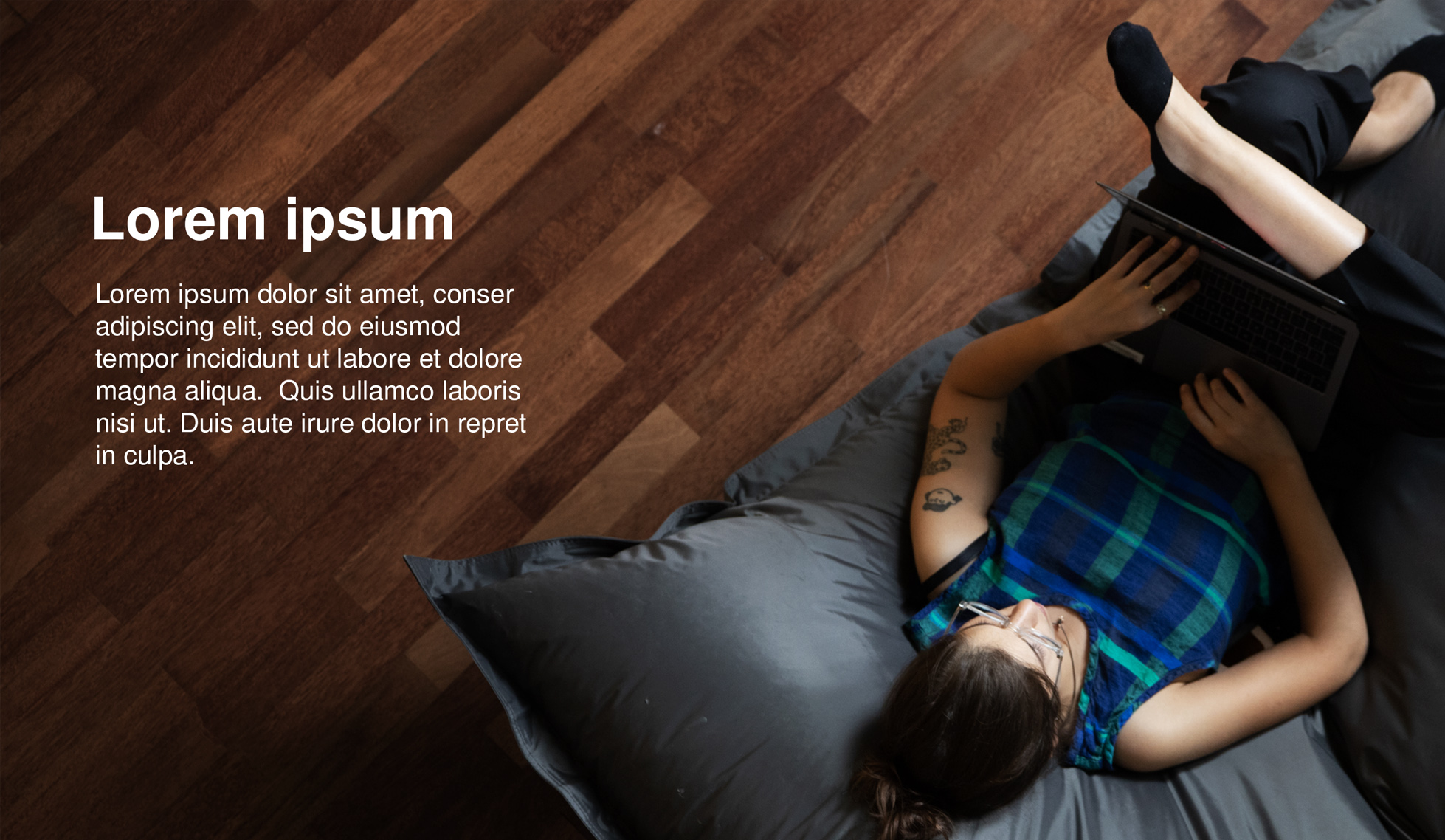
7. The spacer image. I always try to take pictures that have a lot of empty space in them. These kind of images are very useful for presentations, since you can put text on the image.
7. The spacer image. I always try to take pictures that have a lot of empty space in them. These kind of images are very useful for presentations, since you can put text on the image.
8. Play around. Once you have covered the check-list play around with the camera. The world (or maybe the workshop in this case) is your playground. Have fun!
8. Play around. Once you have covered the check-list play around with the camera. The world (or maybe the workshop in this case) is your playground. Have fun!
2. Always have a designated photographer
It’s easy to say that everyone will take pictures during a workshop, but this will, 9 times out of 10, lead to crappy pictures.
Have one person in charge, to keep the check-list (above) in mind.
3. Getting the subjects to trust you
Colleagues tell me they don’t want to get close to people because of the risk of disturbing them in an interview or workshop setting. Most people you would take pictures of in a work setting aren’t used to having a camera in their face. My tip; do it like if you were training a police dog to loud noises.
1. Take many pictures, they’ll get bored of the camera after a while.
1. Take many pictures, they’ll get bored of the camera after a while.
1. Take many pictures, they’ll get bored of the camera after a while.
2. Work your way outwards and in.
2. Work your way outwards and in.
2. Work your way outwards and in.
3. Make sure, to make a point, that you take pictures of other things than the subject. That way they get used to the sound of the camera
3. Make sure, to make a point, that you take pictures of other things than the subject. That way they get used to the sound of the camera
3. Make sure, to make a point, that you take pictures of other things than the subject. That way they get used to the sound of the camera
4. Explain that you’re documenting a process and most pictures won’t be used.
4. Explain that you’re documenting a process and most pictures won’t be used.
4. Explain that you’re documenting a process and most pictures won’t be used.
An simple way to take a nice portrait
Testimonial portraits are quite common in the industry, but a lot of the time they don’t look that great. And it’s understandable. The art of mastering portraits can take forever, but if you’re in a crunch time, there’s a simple way you can get a pretty nice picture in just three steps.
1. Use the natural light from a window and place the person in a 45 degree angle to the window. That way you will get close to a model light without weird shadows.
1. Use the natural light from a window and place the person in a 45 degree angle to the window. That way you will get close to a model light without weird shadows.
1. Use the natural light from a window and place the person in a 45 degree angle to the window. That way you will get close to a model light without weird shadows.
2. Set the camera on widest aperture. Using a high aperture puts all the focus on the person.
2. Set the camera on widest aperture. Using a high aperture puts all the focus on the person.
2. Set the camera on widest aperture. Using a high aperture puts all the focus on the person.
3. Last, but not least. Make sure that the focus is on the eye!
3. Last, but not least. Make sure that the focus is on the eye!
3. Last, but not least. Make sure that the focus is on the eye!
About
Johan Heikensten, Design Director & Strategy Consultant from Sweden
Johan Heikensten,
Design Lead & Strategy Consultant from Sweden
Johan Heikensten, Design Lead & Strategy Consultant from Sweden
©2019 ymer design
©2019 ymer design
©2019 ymer design


